If your website is your brand’s home on the internet, then its homepage is the living room. That one central space that all other rooms connect to.
Chances are, if you want to eat, sleep, relax, play, etc., you’ve got to go through the living room first. Such is the case with a homepage. To successfully get your web visitors to go where you want them to go so they can do what you want them to do (buy, subscribe, visit, call, etc.), your homepage needs to draw visitors in, then redirect them to the other parts of the “home” where the real action is taking place.
This is what we recently did for The Olson Company, who hired us to overhaul its digital marketing infrastructure, starting with a new website. Read the full case study here.
When approaching the homepage wireframe, we went back to the basics building out a page that contains the seven essential elements we think every homepage needs. While design, UX, messaging, and copy make each Truss website completely unique, these seven elements remain consistent, ensuring that each site builds the brand, drives conversions, and benefits from SEO best practices.
The Truss Homepage Checklist
 The “hello”
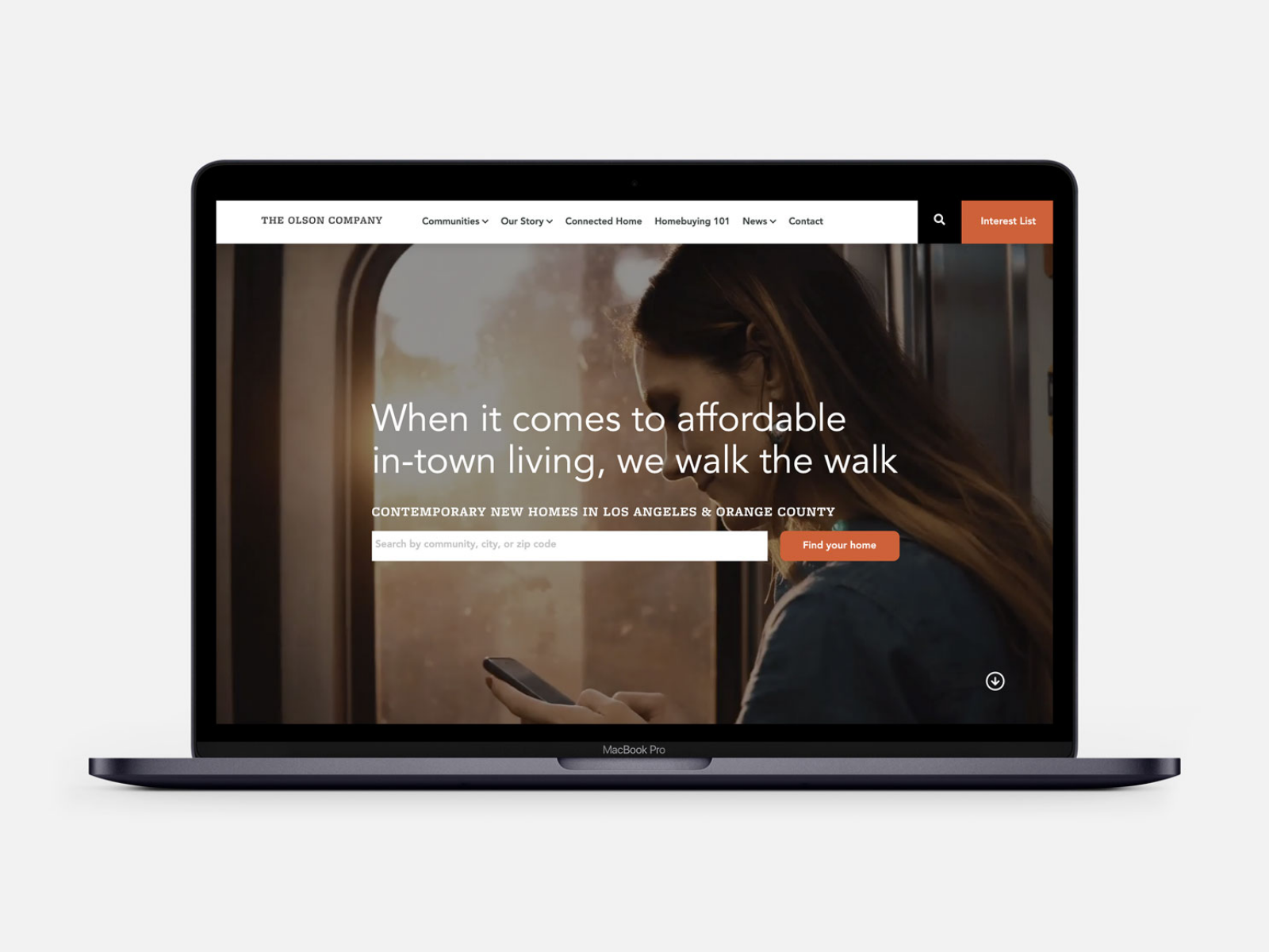
To make an impactful first impression, focus on creating an eye-catching headline on your homepage, preferably “above-the-fold,” the space at the top of the webpage before you scroll down. It should make a statement, set a stylistic tone, and most importantly, signal to your web visitor that they’ve landed in the right place.
For The Olson Company, we riffed on their brand slogan “in town and in reach” for the above-the-fold headline. It works by hinting at the company’s mission (to make affordable, in-town living accessible) while addressing the brand’s unique positioning. Unlike competitors, affordable housing isn’t just an afterthought for Olson. It’s their passion and specialty (“we walk the walk”). Bonus points for the double meaning that highlights the unique selling point of urban walkability at all Olson communities
The what
The next most important thing to communicate is what you do/what you sell. Vision is great. Purpose is even better. But no one will care if they can’t easily understand what you do first. On the Olson homepage, a simple subhead does the trick: “Contemporary new homes in Los Angeles & Orange County.”
The solve
Your customer has walked into your home for a reason. With their needs and pain points in mind, your next step is to let them know that you have a solution for them. You can communicate this through a variety of content, but the important thing is to make the solution easily identifiable (a thoughtful content hierarchy and UX design will help) and communicate its relevance to your customer’s needs.
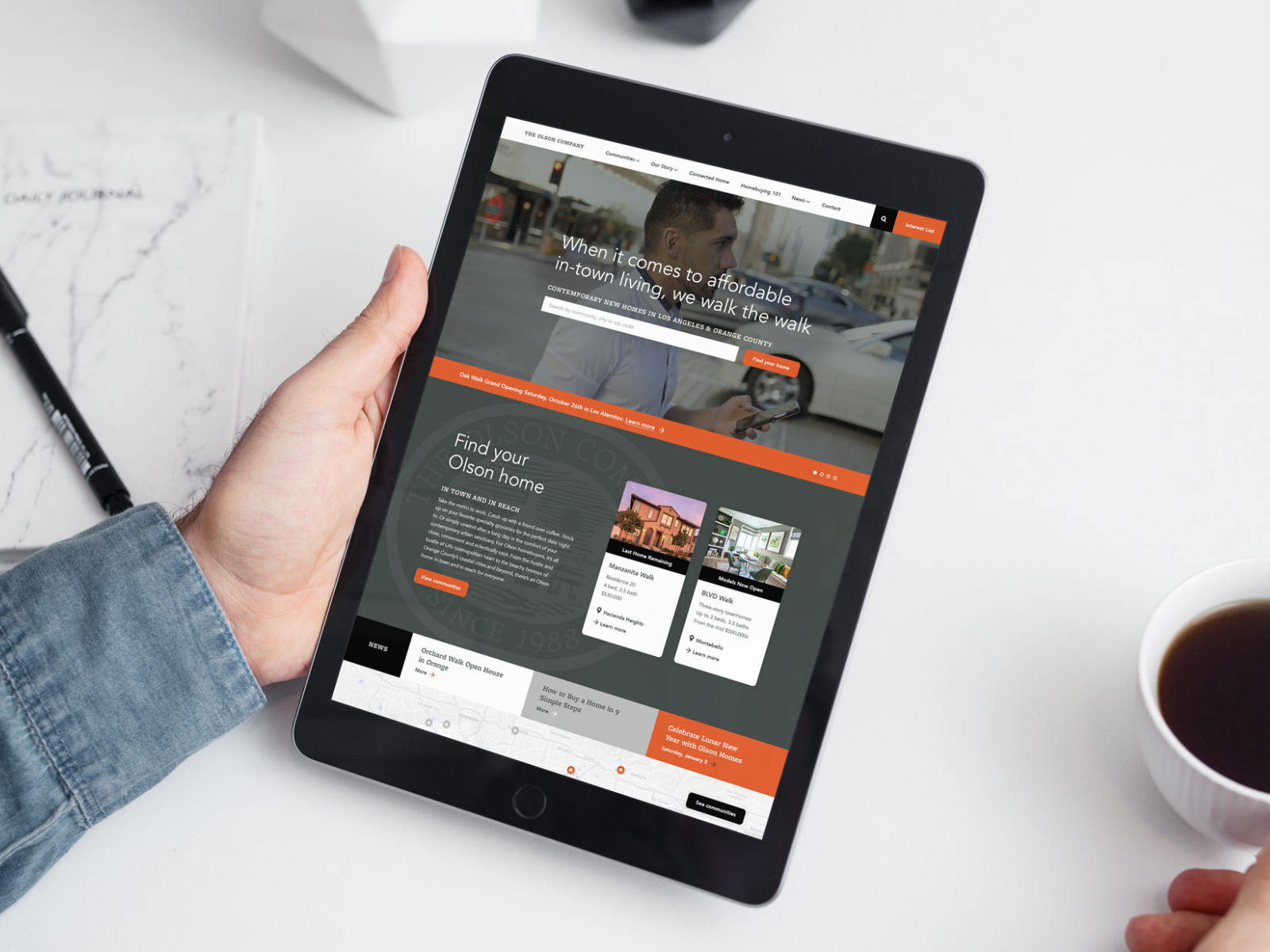
In our Olson example, the entire Find Your Olson Home block is devoted to this goal. In it, we feature content that empathizes with the customer’s challenges, speaks to their desired outcomes, and serves up specific Information and calls-to-action so they can start their home buying journey.
The breakdown
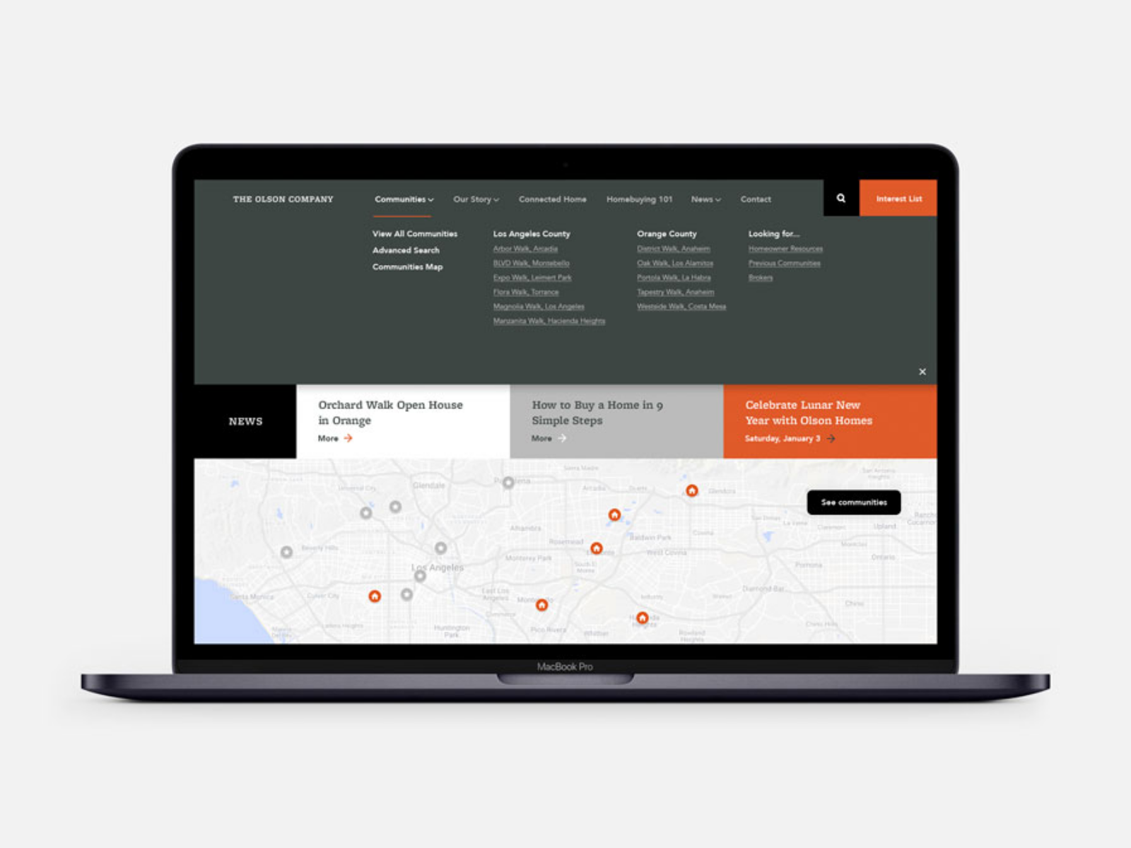
Do you offer multiple products or categories? Are you a multi-divisional brand or do you want to sell to more than one segment? Break it down on your homepage so visitors can get to the point of conversion faster.
Olson builds in two regions, so we make that clear throughout the homepage including a locations map and expanded navigation bar and footer, which both link to subpages organized by region.
Depending on your brand’s offering, your breakdown will look different. The important thing is to design a user experience and/or create content that easily organizes that information.
The bona-fides
You’ve made a great first impression with a strong “hello.” You’ve explained what you do and how you solve your customer’s problem. You’ve been thoughtful about your offer and broken it down by category or segment. You’ve made lots of claims. Now it’s time to show your credibility to prime homepage visitors for a conversion. Testimonials, reviews, media blurbs, award icons, and various social proof mechanisms (“Over 1 million downloads”) are all common ways of building credibility or authority. For Olson, we relied on their stellar archive of homebuyer reviews to signal to prospective buyers that they are dealing with a trusted homebuilder that delivers on its promises.
The ask
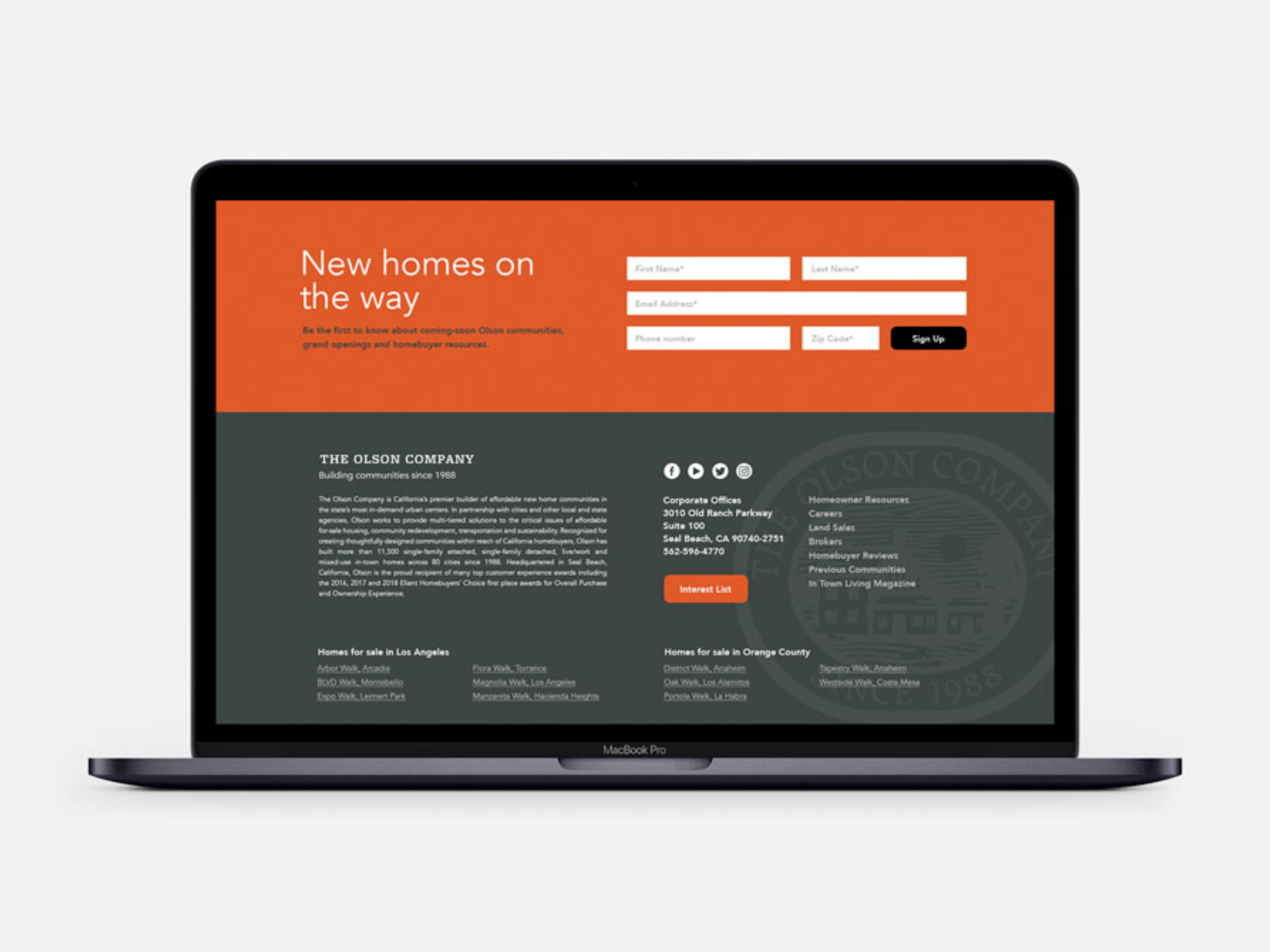
After all this, it’s time to make your ask. What do you want homepage visitors to do? Consider primary calls to action (CTA) as the ultimate goal of your website. For an e-commerce brand this is often a “Shop” or “Buy Now” CTA button. For a service-based brand or product business that sells offline, the primary CTAs are often “Call Now,” “Schedule a Consult,” or even “Join the Interest List.”
Secondary CTAs, also known as transitional CTAs, are all the smaller asks that you make on the road to the big ask, such as “Learn More,” “Subscribe,” or even “Watch Video.” Regardless of which you use, your homepage should offer plenty of opportunities for visitors to take action.
The boilerplate
It’s not sexy, unless you’re into SEO optimization (and we are), but the boilerplate is explanatory copy that distills your entire business down to one info-packed paragraph. It’s keyword-rich, sums up your main selling points, and offers a brief corporate overview.
For Olson, we chose to nestle it into the website footer, ensuring the site reaps all the SEO benefits without belaboring the homepage design with a lengthy copy block.
Does your homepage check all the boxes? If you need help with the basics and beyond or want to learn about our website services, get in touch at hello@trusscreative.com or call +1 949 612-7585.