Eight seconds. That’s how long you have to capture the attention of the average adult—less than a goldfish according to experts.
It’s not that we’re incapable of paying attention. It’s simply that there is an influx of information and stimuli vying for our attention all at once, making it challenging to stay focused on one thing for an extended amount of time. How can your brand break through the noise to capture the interest of your target audience?
When it comes to customer interaction, email continues to be the holy grail of marketing communication and holds an average ROI of $44 for every dollar spent. But before you launch your next email campaign, there are a few key practices and design elements that can help your emails from being left lonely and unread.
Best practices for successful brand emails

Start strong with the subject line
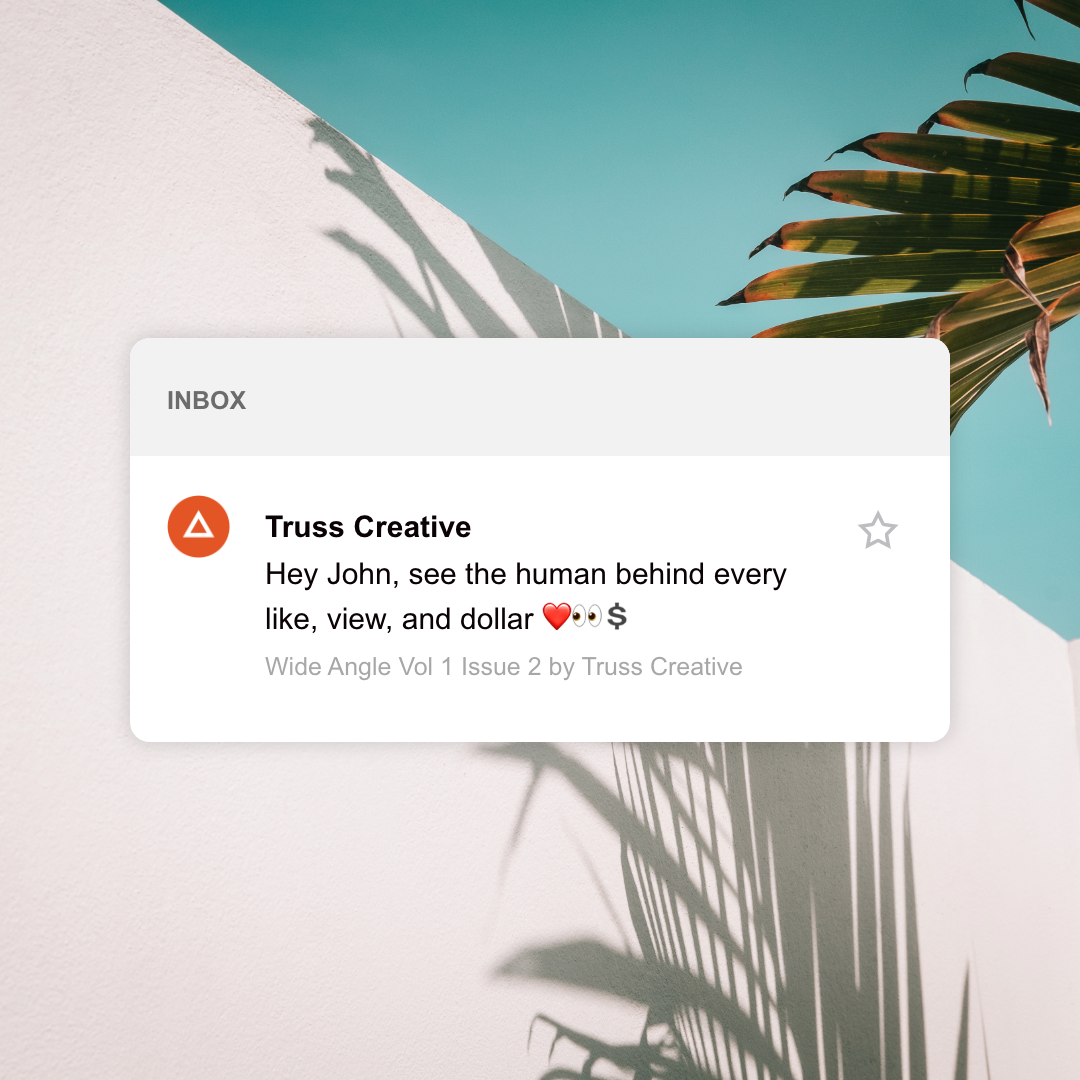
As the first thing you see, the subject line is undoubtedly the most important part of any email. A great subject line will capture your audience’s attention in just a few seconds and entice them to click through. The key is to summarize what your email is about, provide value that leaves the reader wanting to know more, and keep it concise—we recommend no more than 9 words or 60 characters.
Don’t neglect the preheader text
The preheader follows the subject line and gives a preview of what your email is about. It’s the second thing your viewers see before opening an email and many times, it’s taken automatically from the first sentence of your email message. However, to boost the open rates of your email, customize your preheader. A successful preheader should build curiosity, work alongside your subject line, and remain under 140 characters.
Personalize to your audience
Studies have shown emails with personalized subject lines are 26% more likely to be opened than those without. That’s because a personalized email helps humanize your brand and make your marketing feel more thoughtful. Based on who is receiving your message, you can get creative by personalizing elements such as the subject line, content within the email known as “smart text,” or the call to action. While the possibilities of personalization are endless, the key is to keep it simple and provide your audience with an experience targeted for them.
Stay on-brand
Have you ever noticed that all of Apple’s emails have a similar look and feel? Without reading the content, it’s easy to recognize an email from them because it’s consistent with the rest of their brand. Whether you’re a larger corporation or a small mom-and-pop shop, your email marketing should complement the rest of your brand content to benefit from and enhance awareness. To keep your email on-brand, it’s important to incorporate:
- The same tone, colors, and fonts used across your other marketing materials
- Your logo and link to your website and social media
- A call-to-action (CTA) that is relevant to your product or service
Break out a well-designed layout
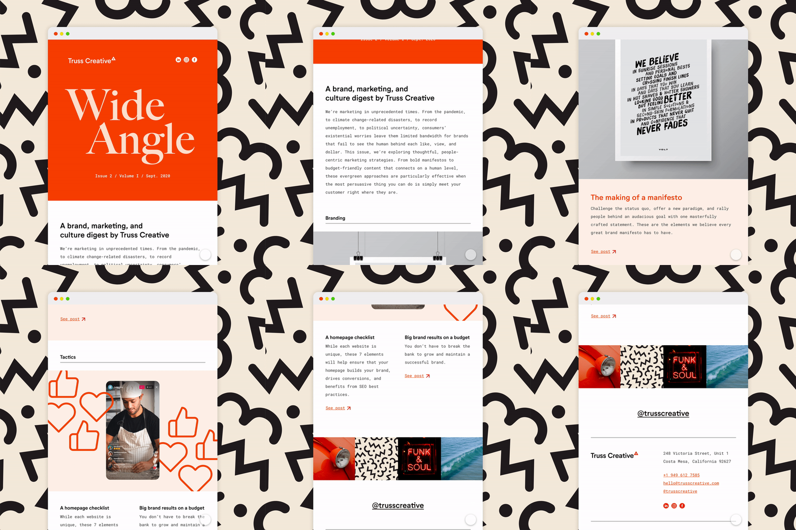
We’re going to let you in on a secret—even us writers don’t enjoy reading emails with paragraphs of lengthy information. Chances are, the same goes for your audience. When you only have a few seconds to capture someone’s attention with an email, it’s important to keep it visually appealing. Break up the wordiness by using layouts or templates with the user experience in mind. Keep the information organized and incorporate visual content such as images, color, or video to provide a more memorable experience.
Use a responsive design
Have you ever read an email on your phone that requires you to zoom in and out to view the whole message? A responsive design fixes that by optimizing your email to fit the screen it’s being viewed on. Whether your audience is using a phone, laptop, or tablet, they will be able to read your emails with ease. Plus, with 3.5 billion users worldwide using smartphones, mobile-friendly email designs are an absolute must have.

Avoid image-only emails
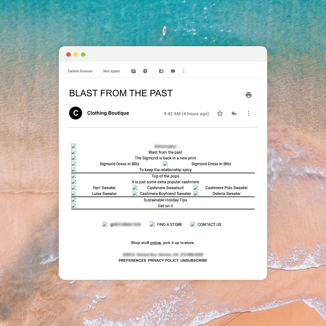
A picture may be worth a thousand words, but only if you can see it. When it comes to email marketing, emails made up almost entirely of images may look attractive, but they can actually hurt your open rates and keep your audience from seeing your message. These types of emails are often associated with spammers causing your message to end up in a spam folder or blocked entirely. They also run the risk of not loading on mobile devices or being difficult to view since it’s common for subscribers to have images turned off in their email settings.
Help your audience take action
Ultimately, you want to guide your audience on their user journey. A call-to-action (CTA) is a way to do that. It not only directs your recipient to do something, it’s also a way to track the conversion and metrics of your email. Use CTAs to get recipients to learn more, visit your website, make a purchase, follow your social media, or all of the above. Effective CTAs have a few things in common; they’re simple, they stand out from the rest of the email, and they entice readers to click by offering value.


