From redesign to reimagine
We were approached by Land Advisors’ California subsidiary to redesign and professionalize a suite of their print collateral. Immediately we knew there was more that could be done to elevate the LAO brand. After a period of discovery, we were greenlit to reimagine the LAO California brand experience.
Positioning
Brand Strategy
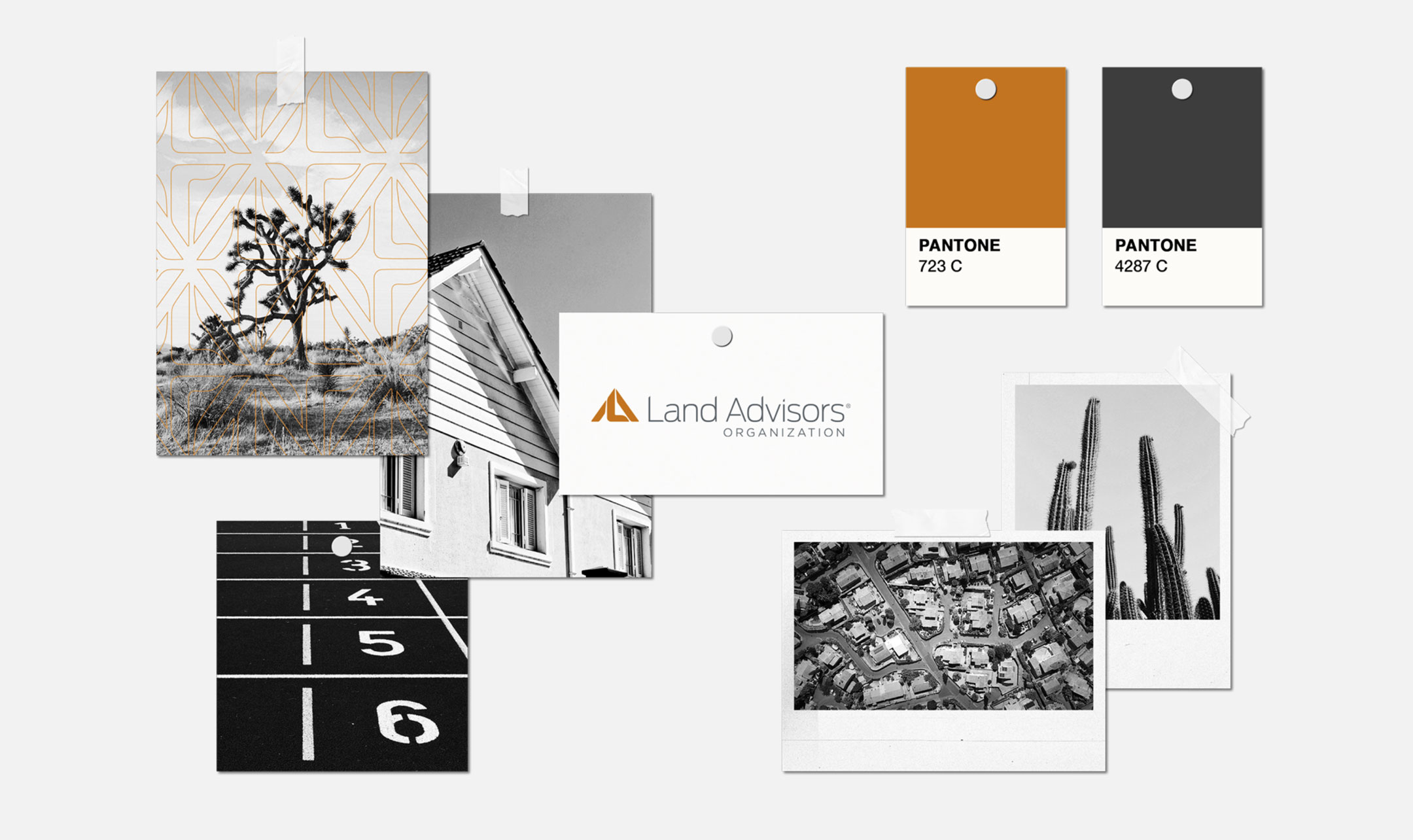
Visual Identity
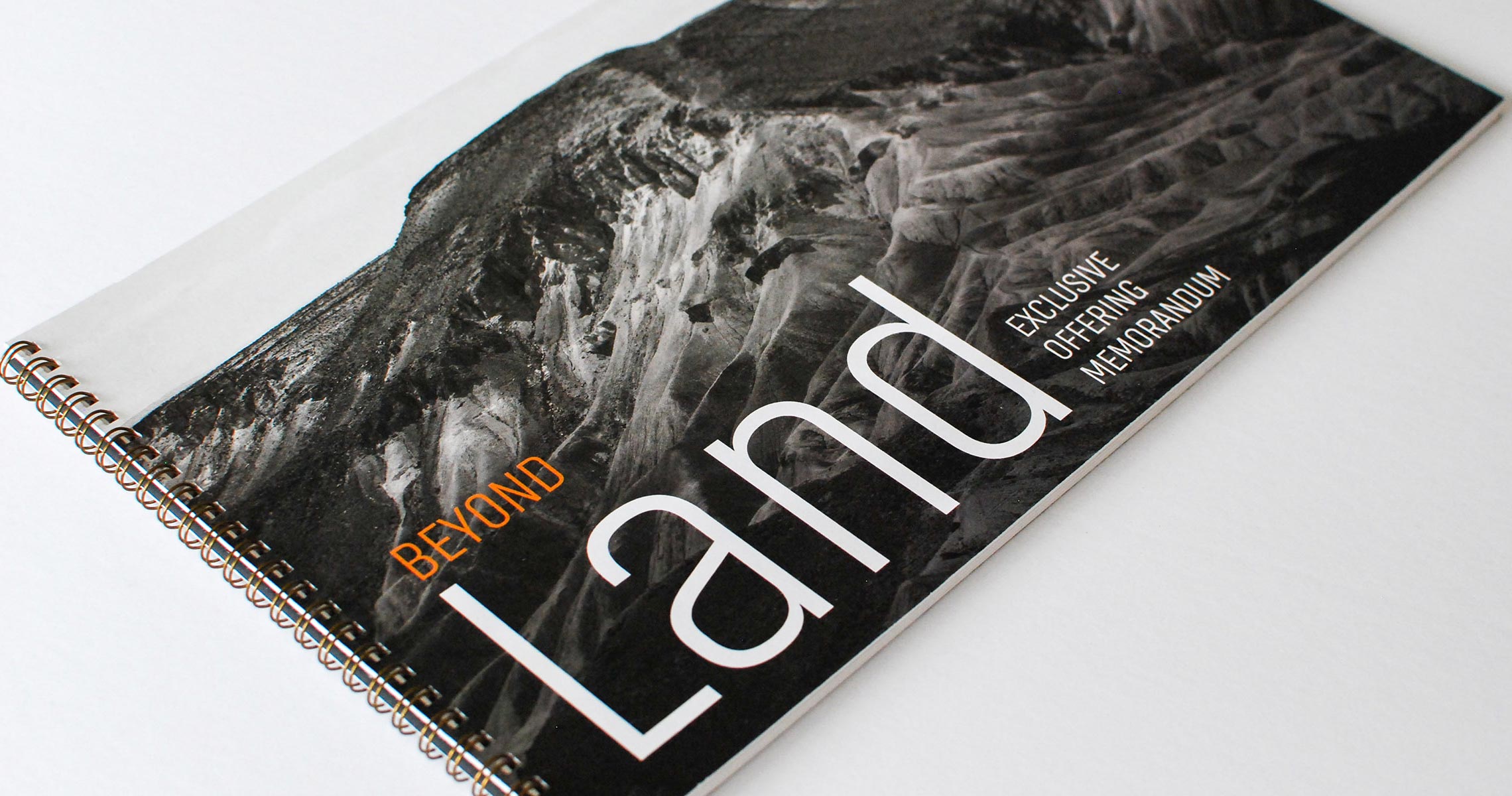
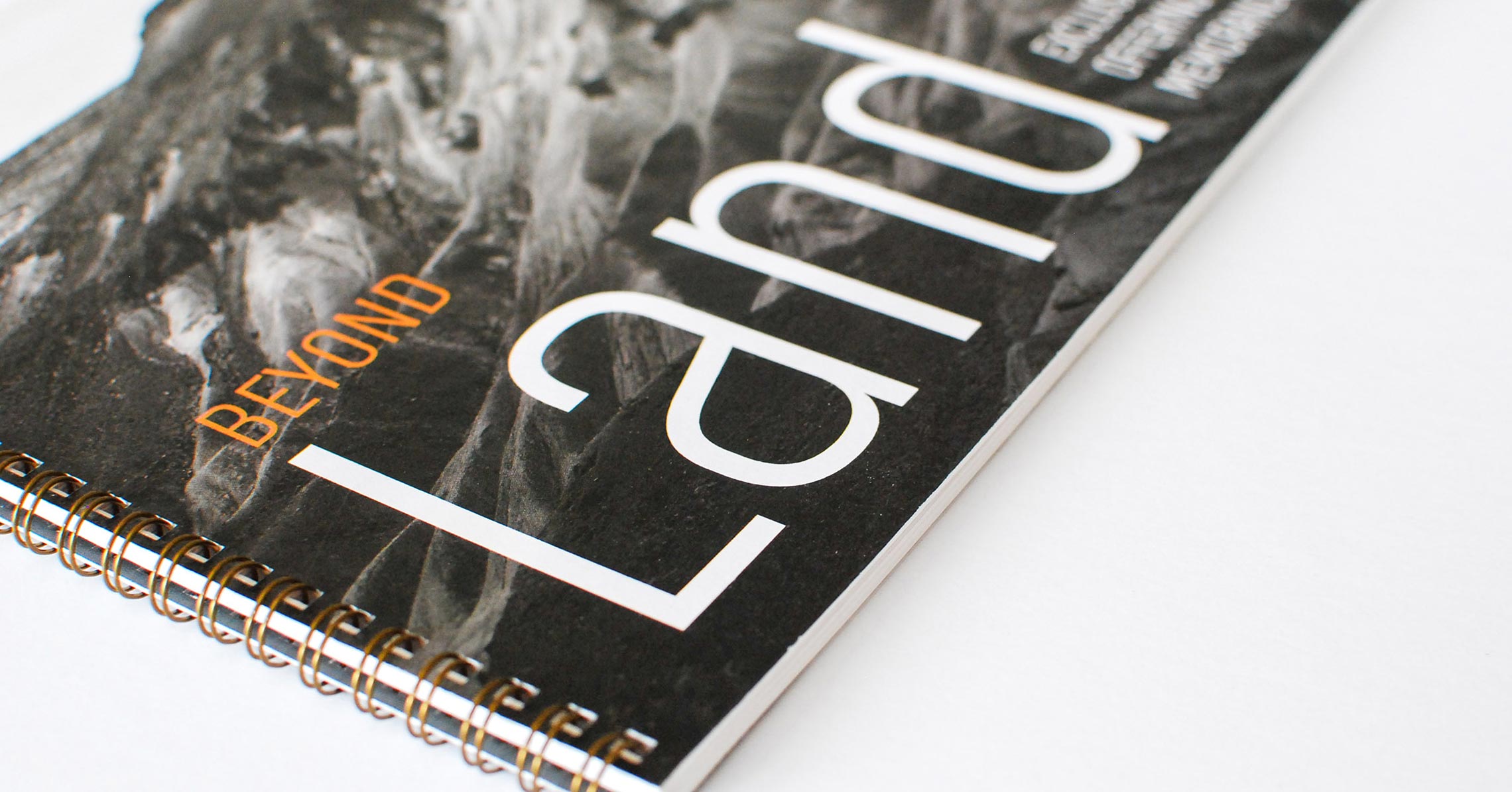
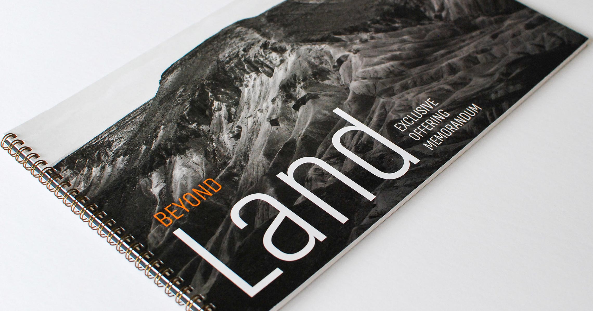
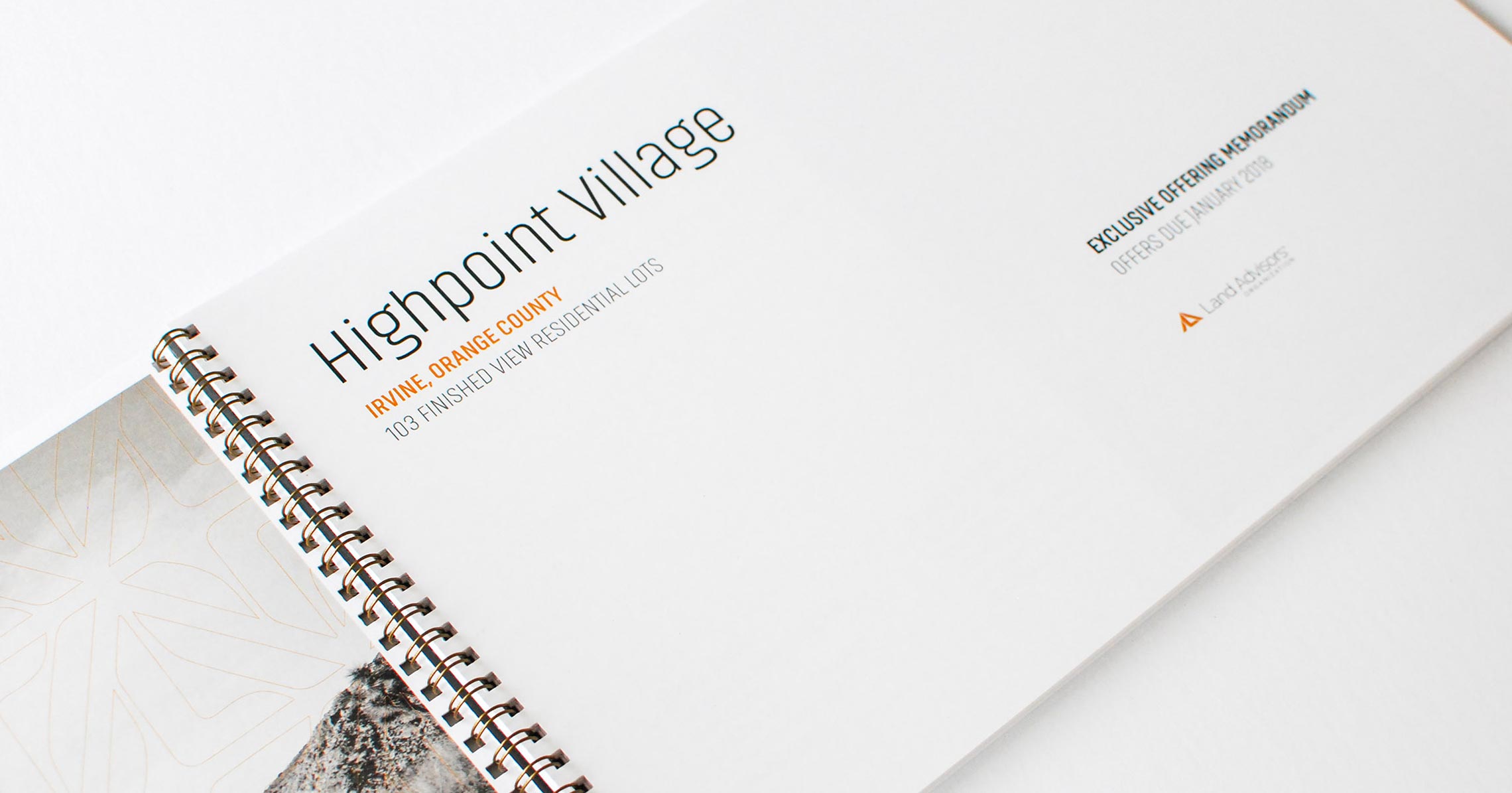
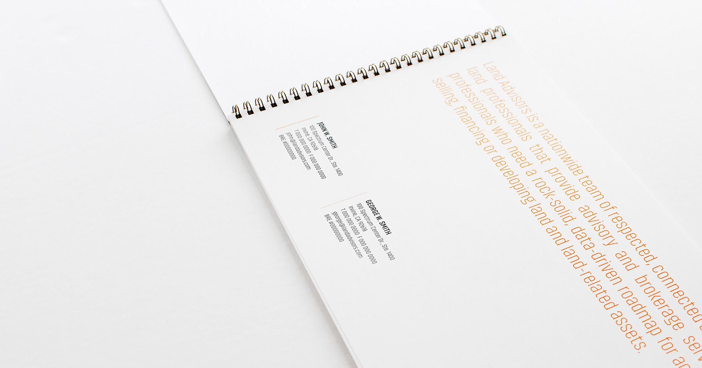
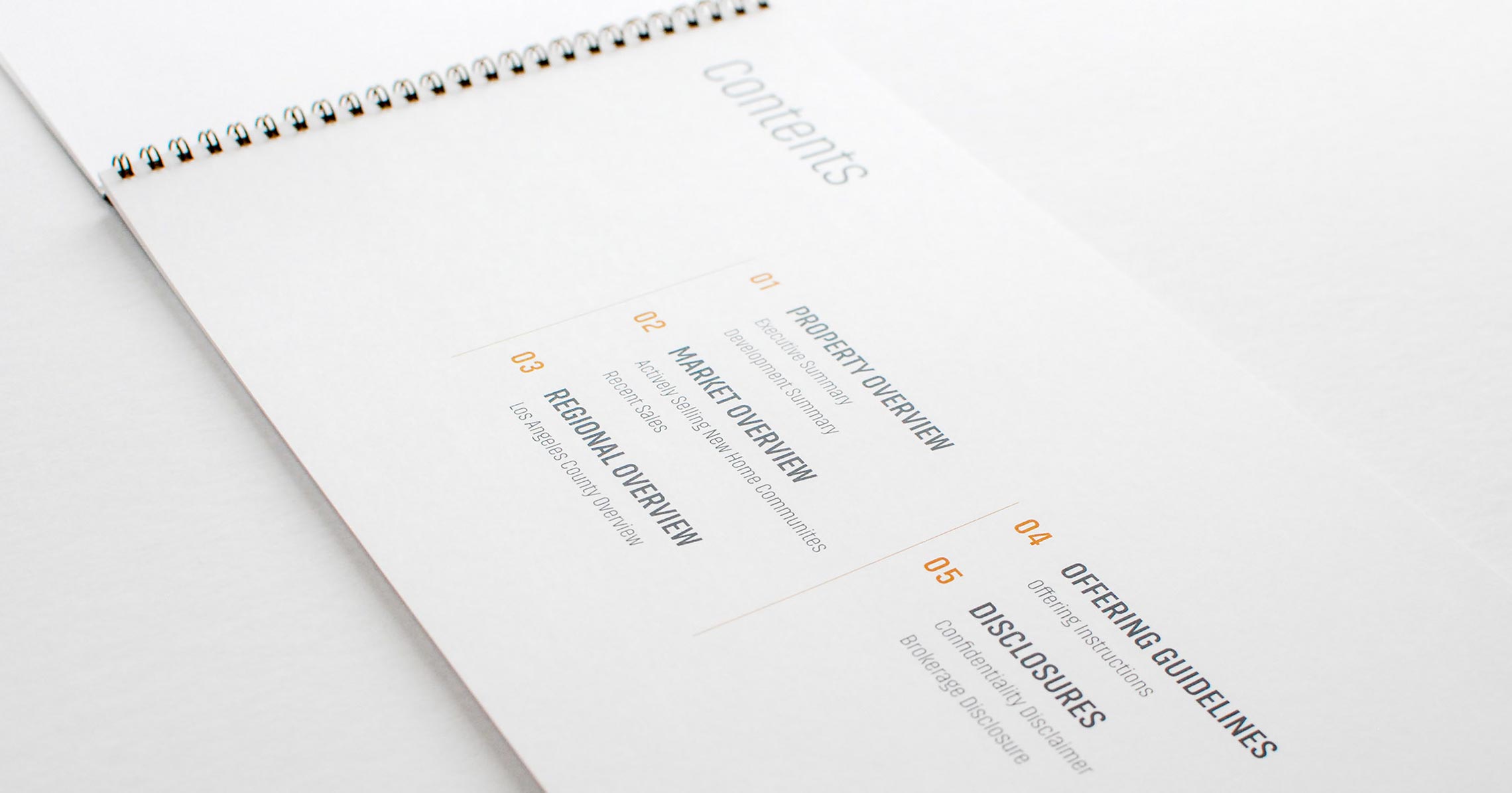
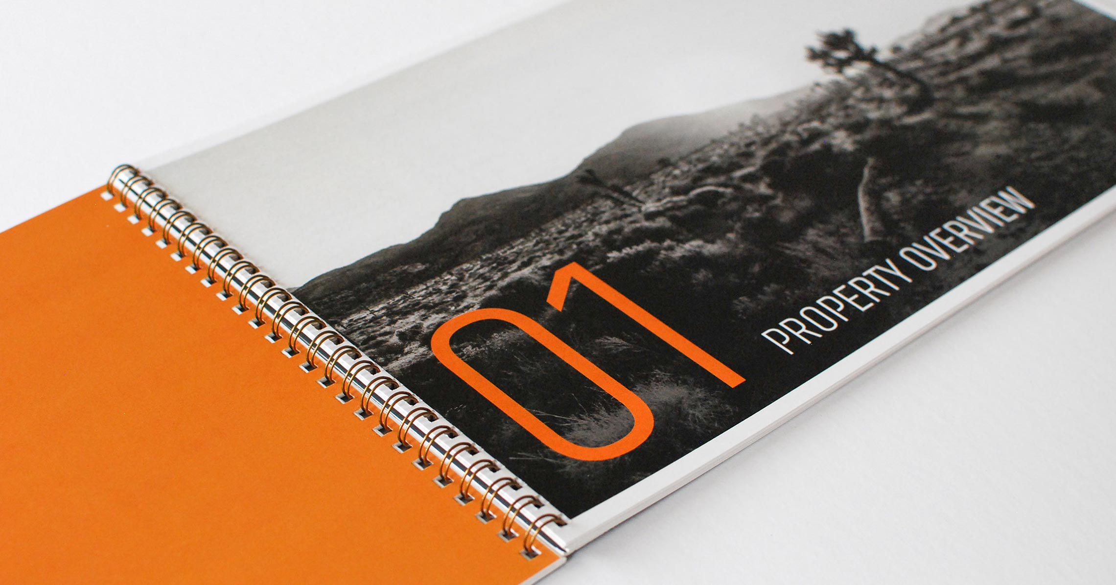
Print Collateral
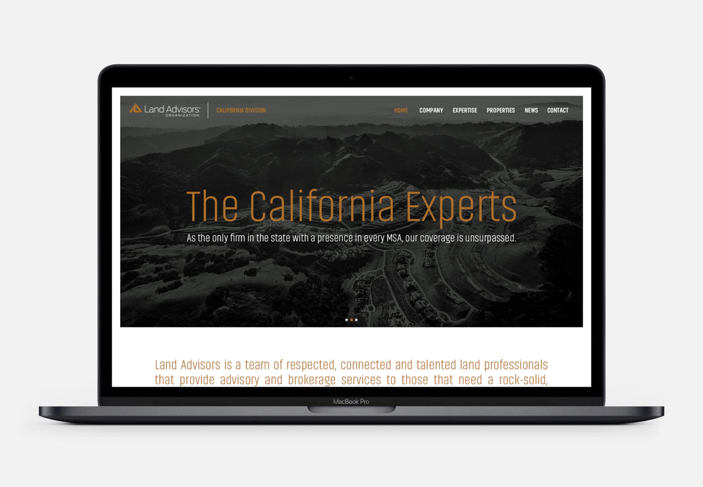
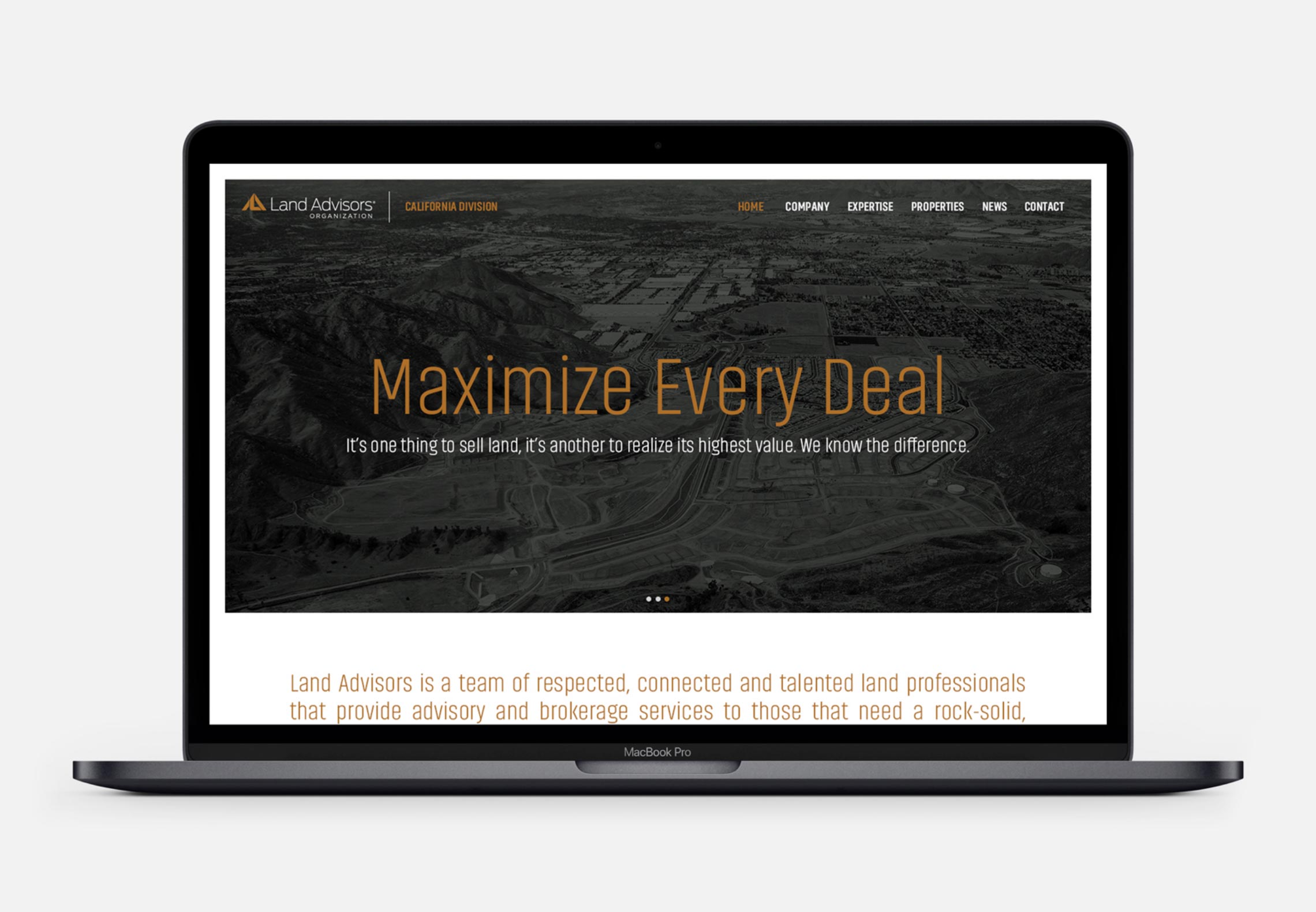
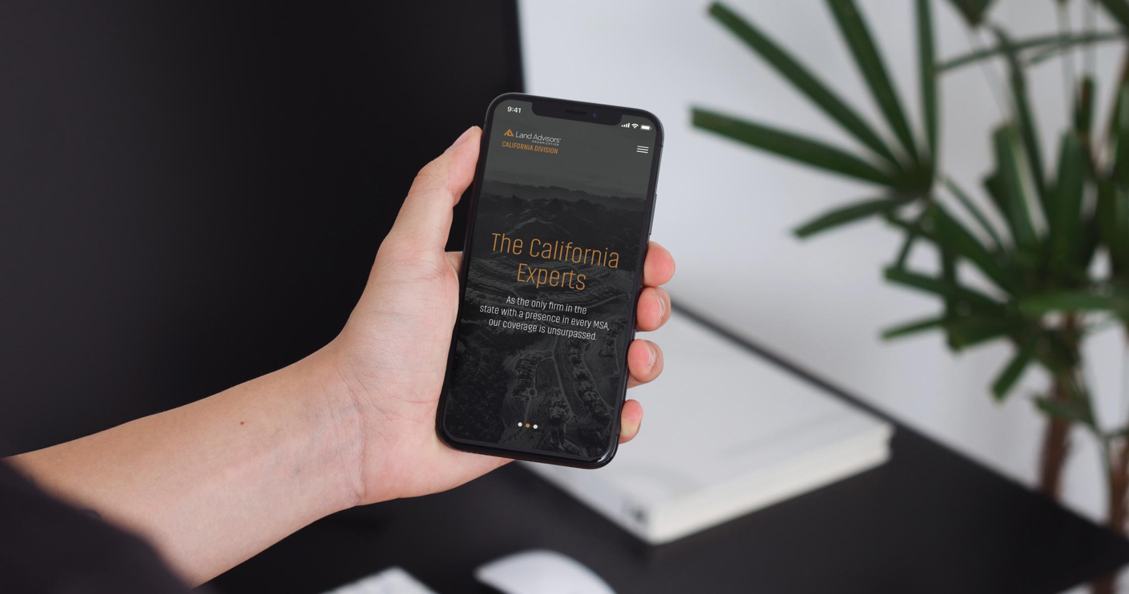
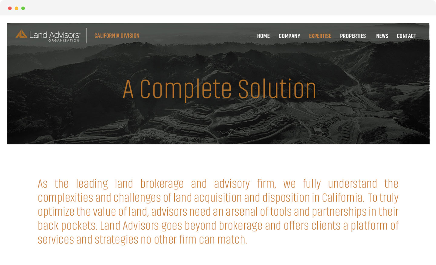
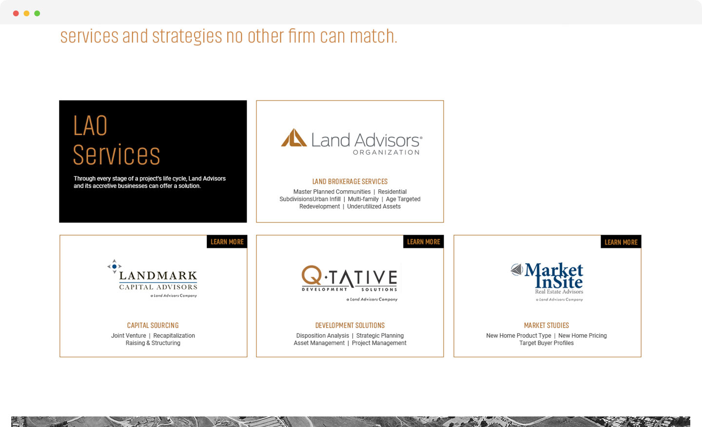
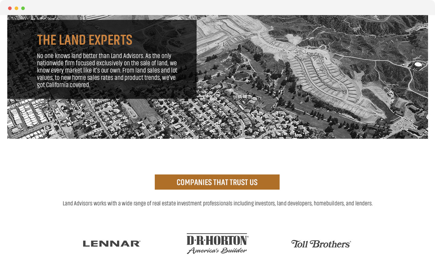
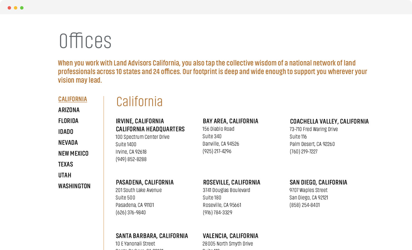
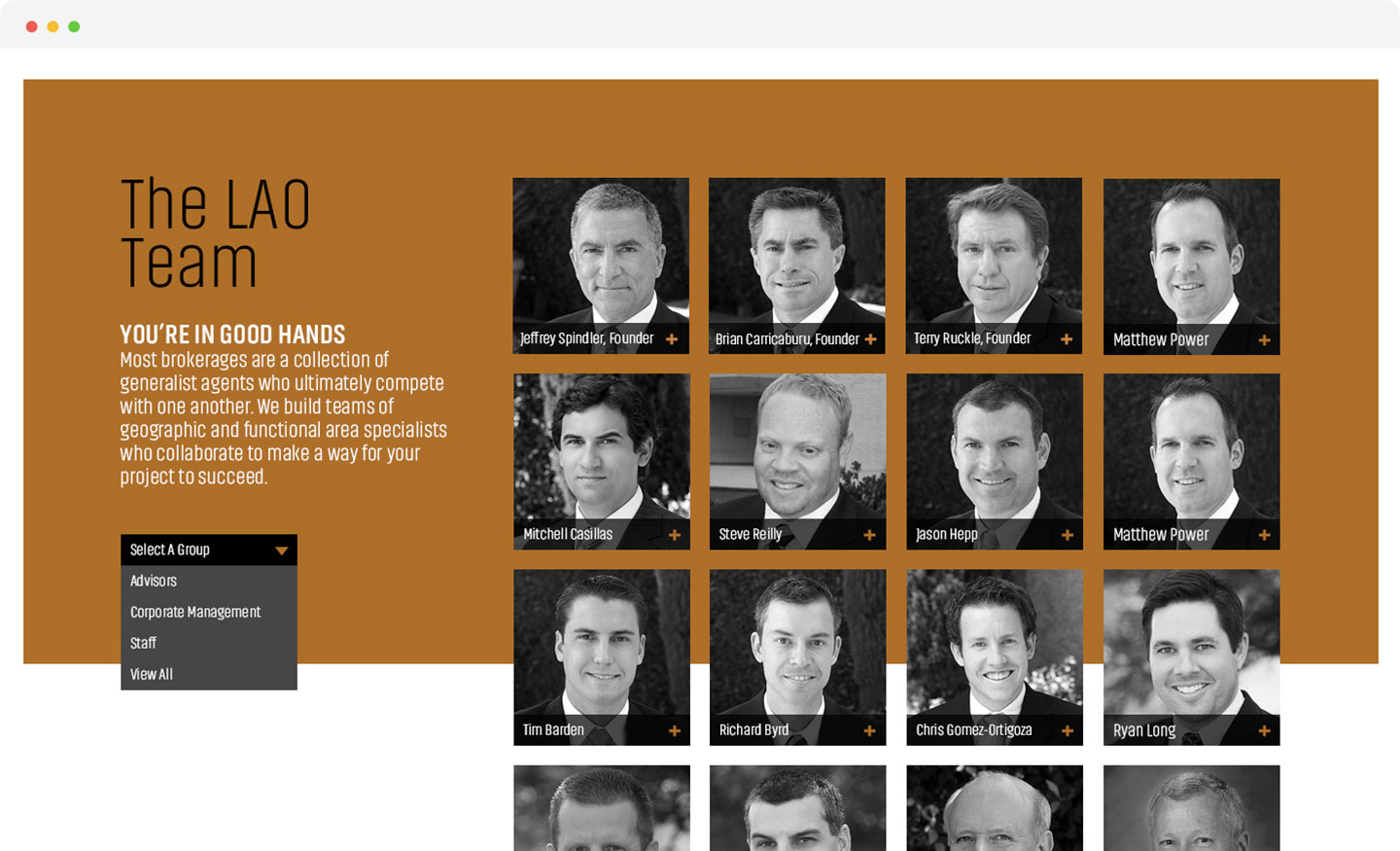
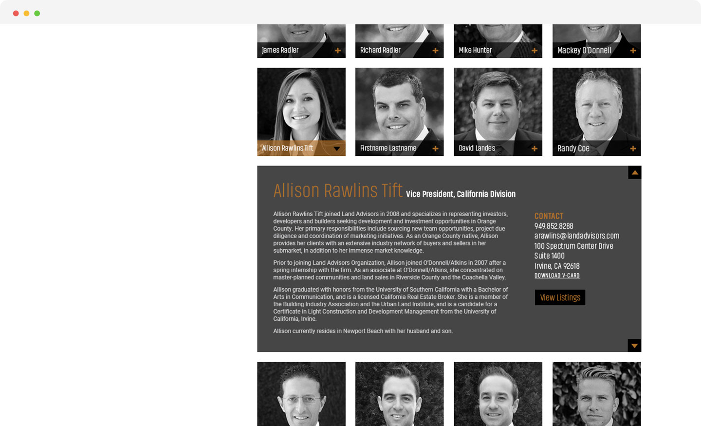
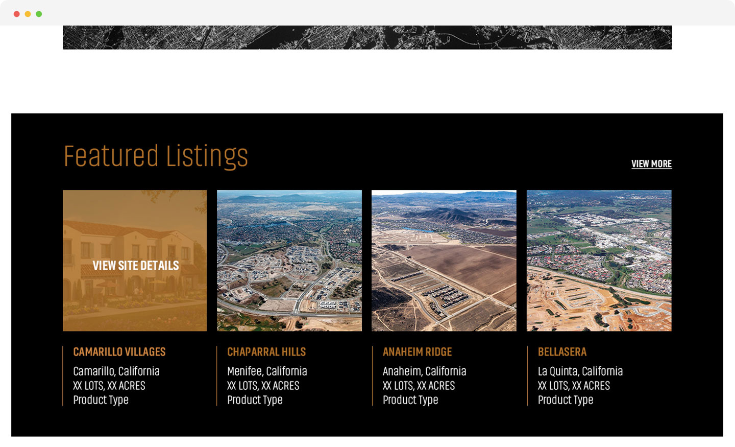
Website
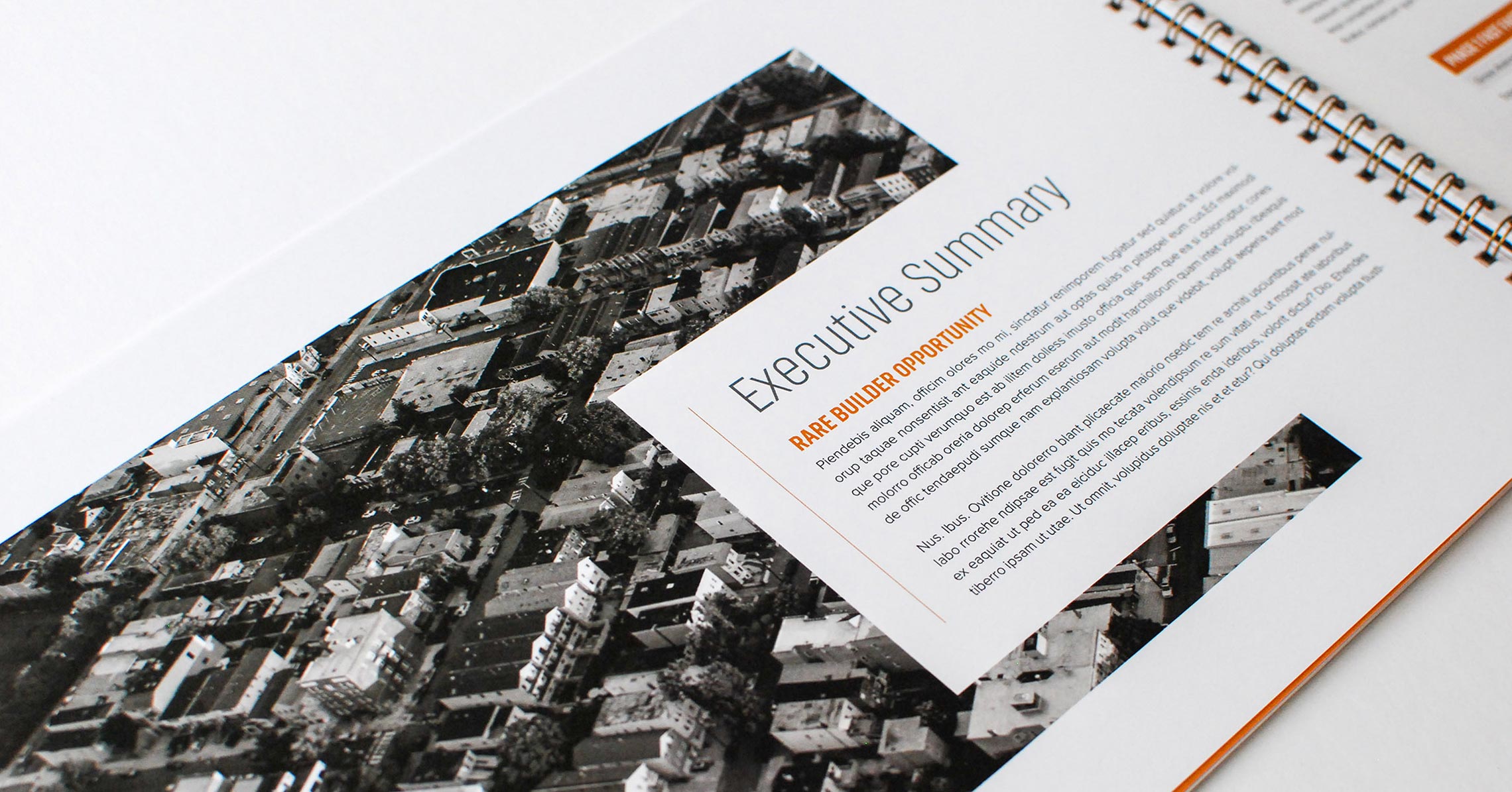
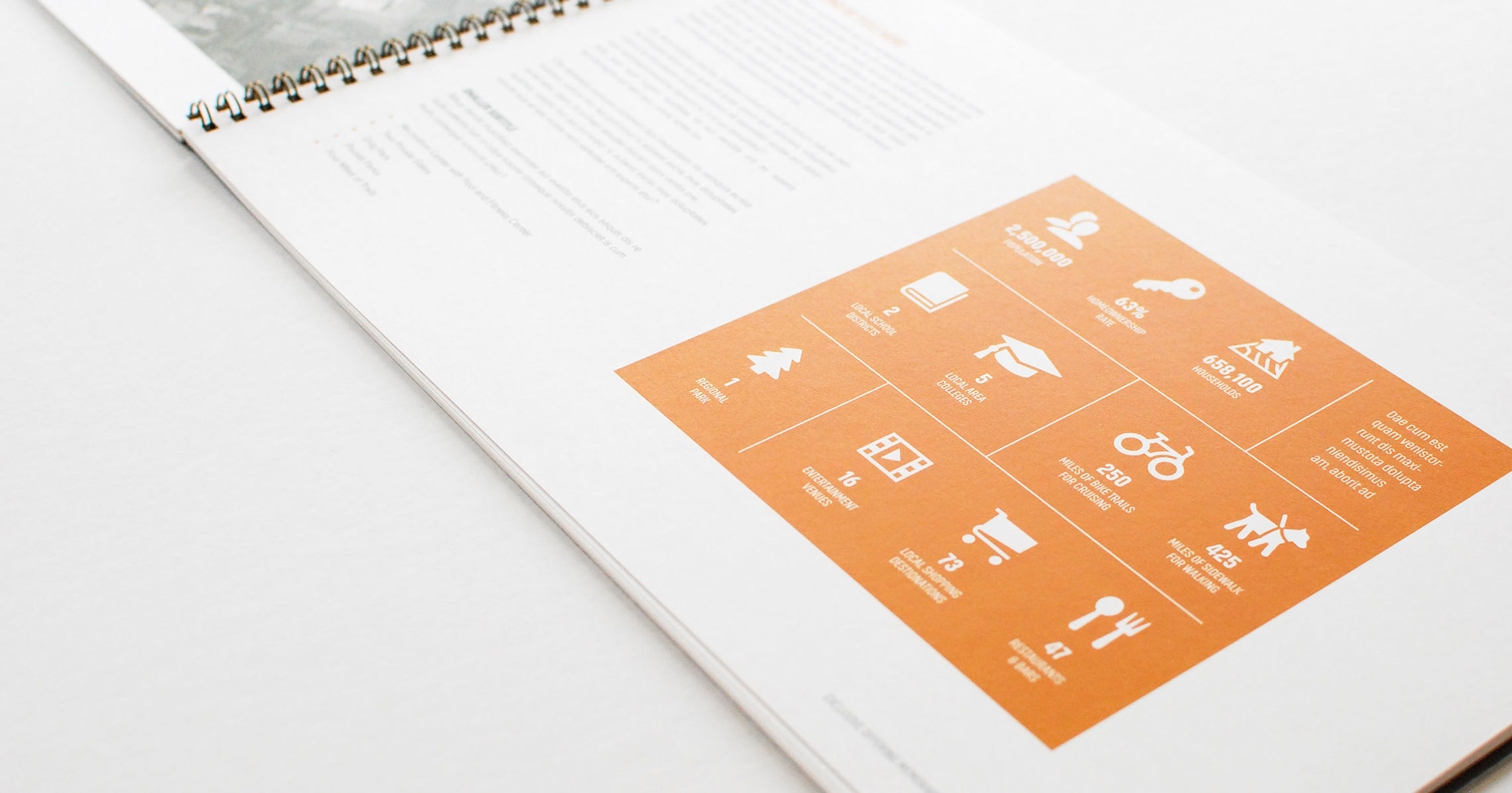
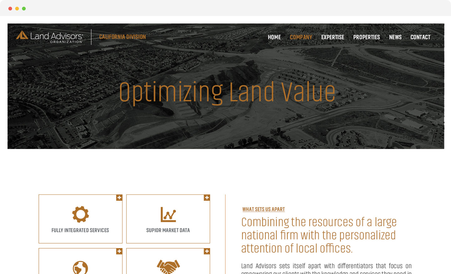
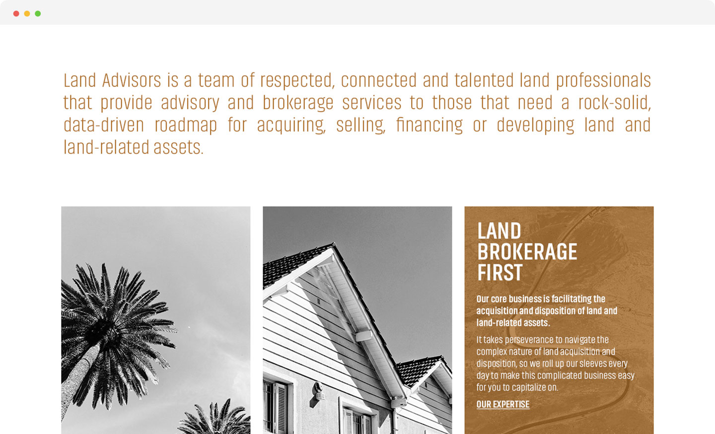
Of grit and dirt


An authoritative voice
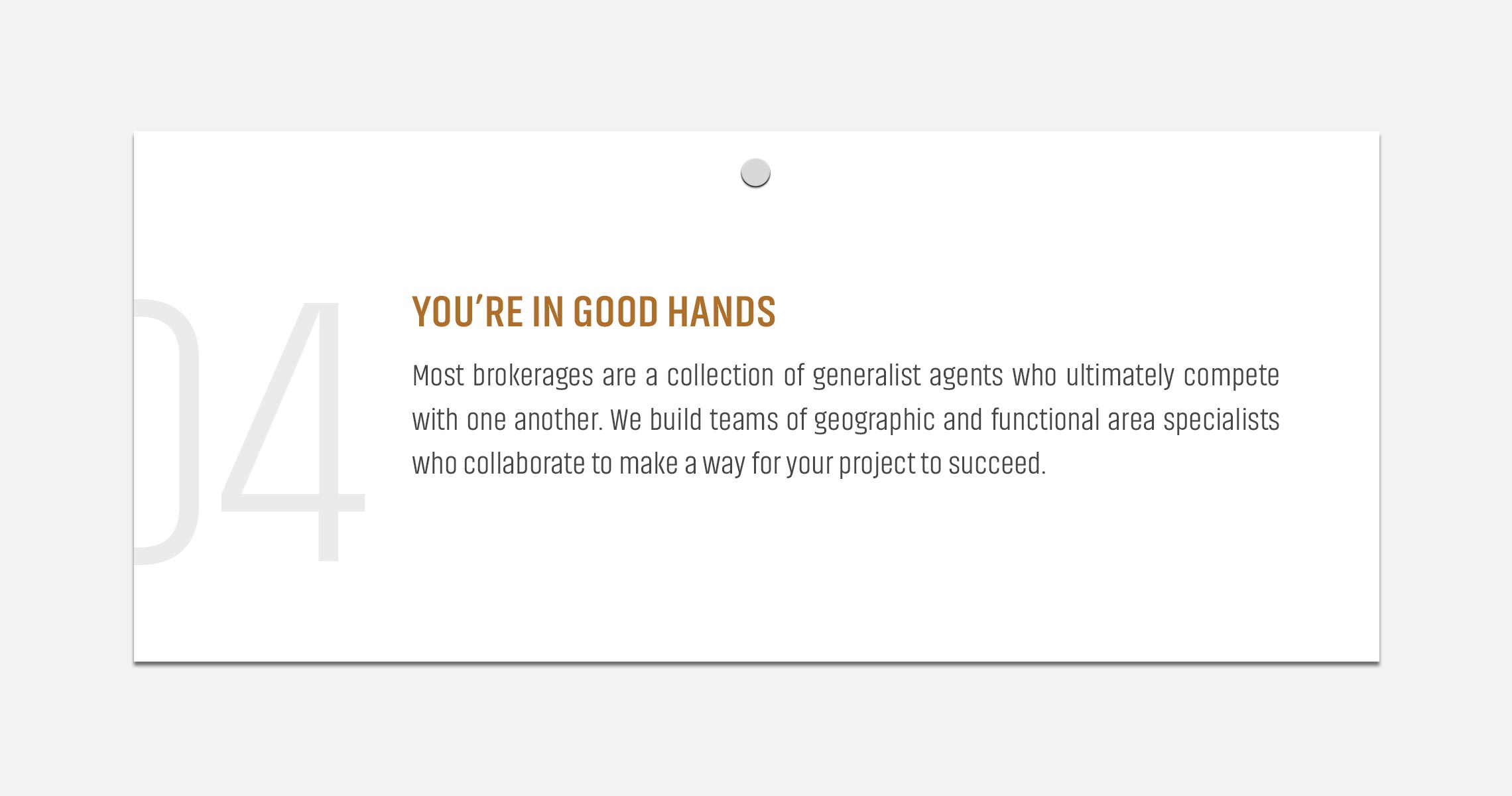
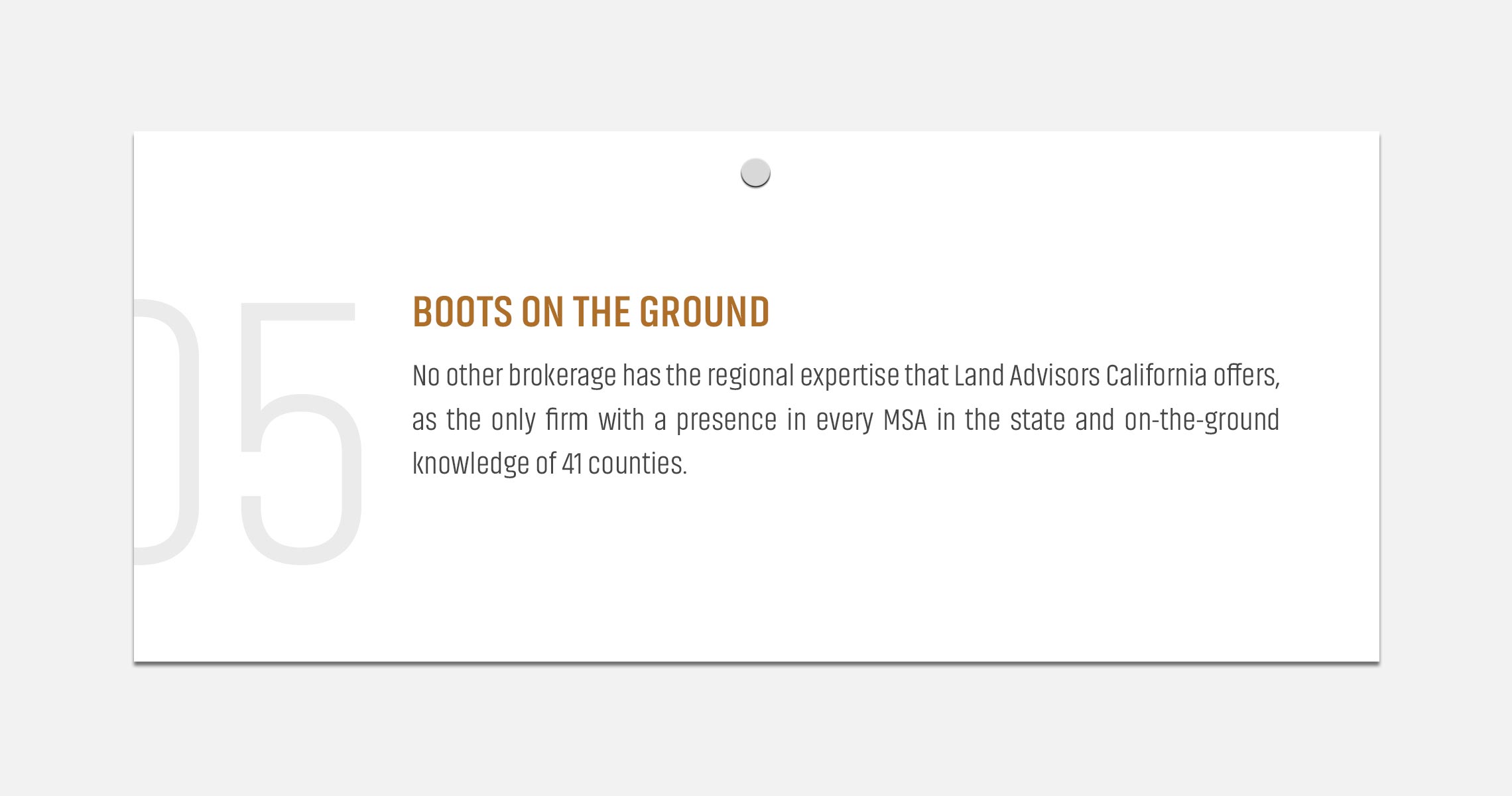
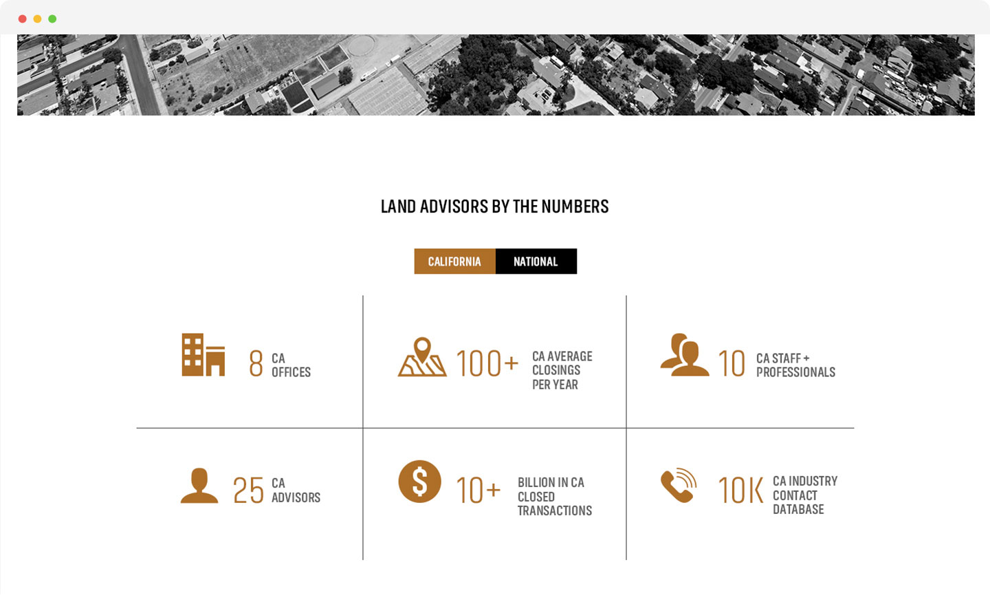
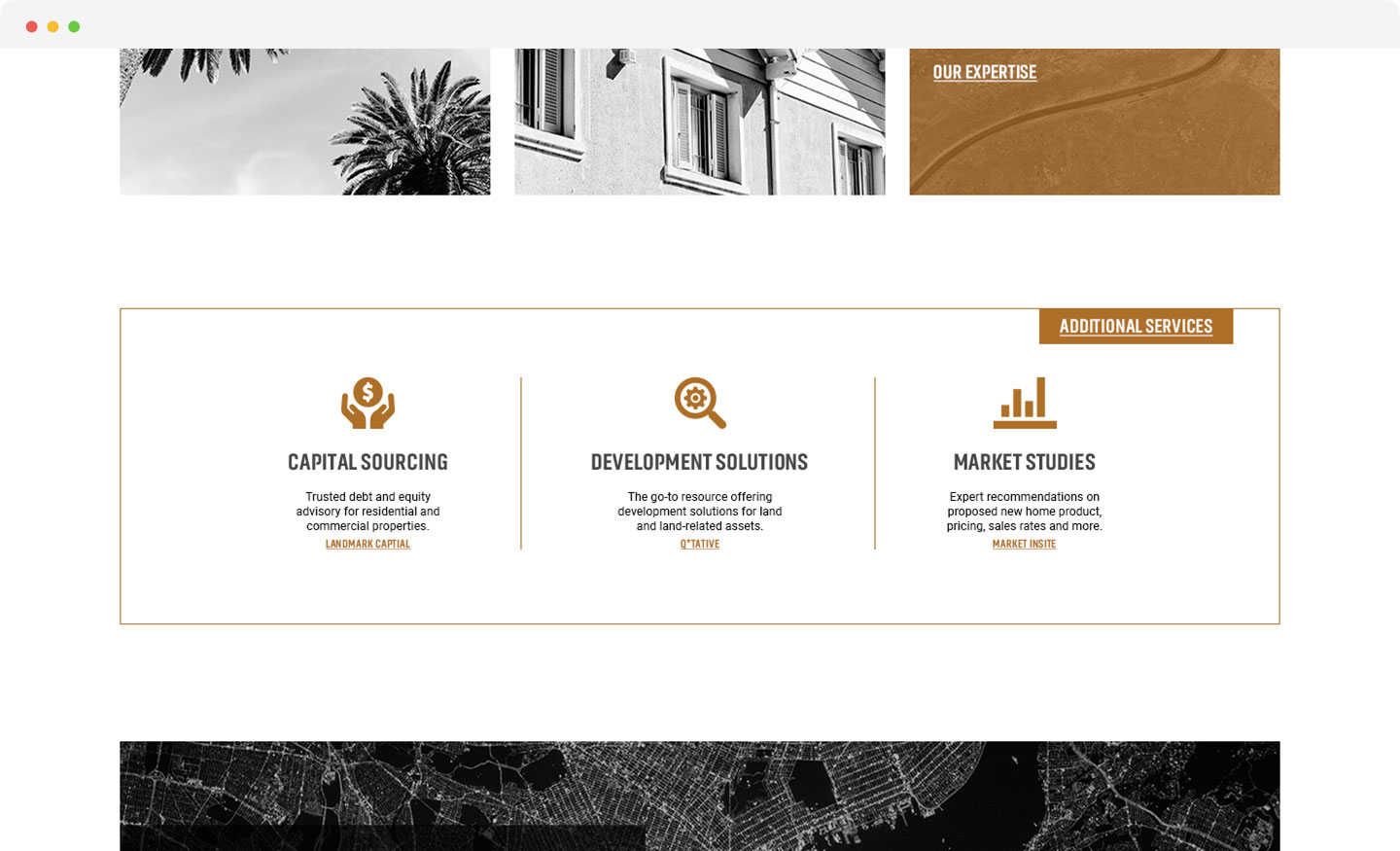
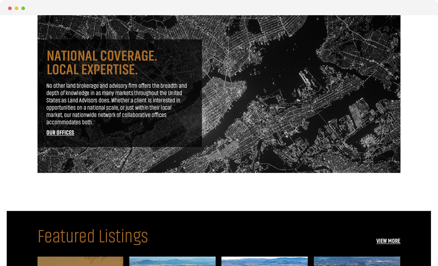
LAO’s website and collateral content suffered from the curse of knowledge. They were so close to the details of their business that their message was muddied under layers of minutiae. We refined their communications to a handful of compelling messages that tell the LAO story with clarity and authority.


The results
Our client’s Arizona peers caught wind of what we were doing for LAO California and requested a meeting. Inspired by our work, we were retained to create a cohesive corporate brand strategy and website for the entire Land Advisors Organization. By revitalizing the brand, client perception of the LAO brand improved and is outperforming rivals in deal volume and value.